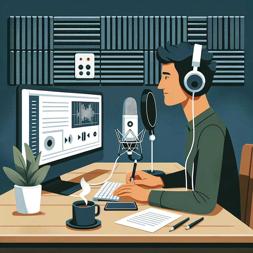
I’ve been down the rabbit hole of making my podcast art stand out on Apple Podcasts and other platforms, and here’s what I’ve learned.
First, let’s talk about what catches the eye.
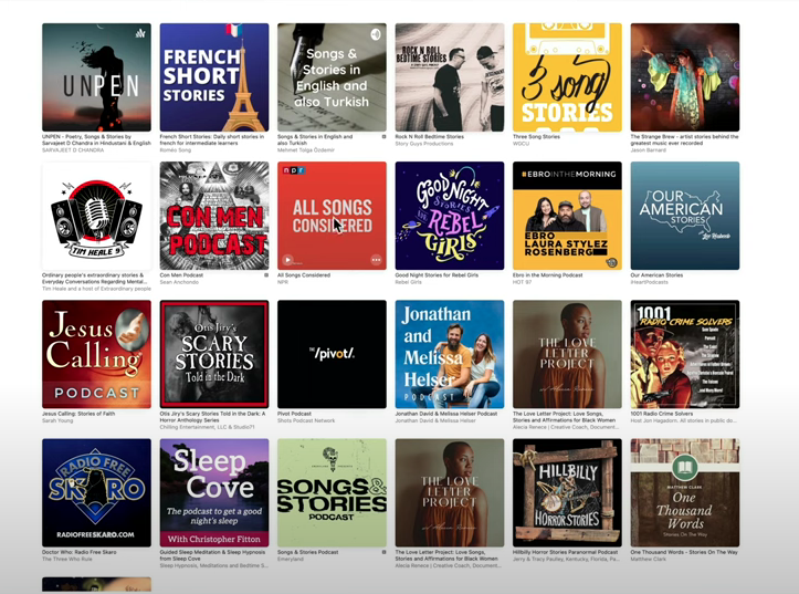
While searching in Apple Podcasts, I stumbled upon podcasts like ‘God’s Country’ with its super sleek design, and ‘All Songs Considered’ which really pops with its bold orange hue.
It’s all about that first visual impression.
Color trends are fascinating.
In categories like music or arts on Apple Podcasts, you’ll notice a pattern – lots of blacks, grays, and blues. Then suddenly, you see a podcast with a yellow background that just stands out.
It’s a great reminder that choosing a unique color scheme can really set your podcast apart.
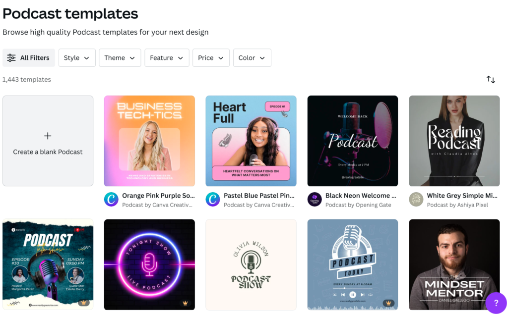
For the DIYers out there (because we love a good side hustle), tools like Photoshop and Canva are your best friends.
And if you’re looking for inspiration or ideas, AI tools like DALL·E or Midjourney can help with your overall design and color scheme.
The goal?
Remember, it’s about being bold, being different, and making sure your podcast artwork aligns with the vibe you’re going for.
Just keep an eye on what colors are trending, make sure you’re not copying anyone, and use the right tools to make something that feels like your podcast.